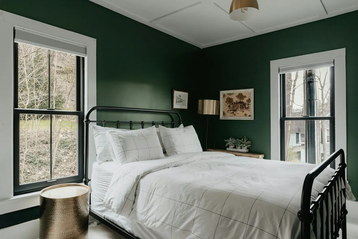
Dear little room,
I owe you an apology.
For months, I've been calling you difficult. Too small for a proper sitting room. Too awkward for a convincing office. Too dark in the afternoons, despite the perfectly respectable window you've been doing your best with.
I've moved the chair three times. I've tried different curtains. I've stood in your doorway with a cup of coffee, wondering whether another shelf might solve something.
And every time I imagined painting you, I reached for the same safe answer.
White.
Then one morning, while the coffee machine hummed in the kitchen and a narrow band of light crossed your floor, I found myself asking a different question.
What if you didn't need to feel brighter? What if you needed to feel more like yourself?
Thursday, 9:15 a.m.The color I couldn't stop looking at
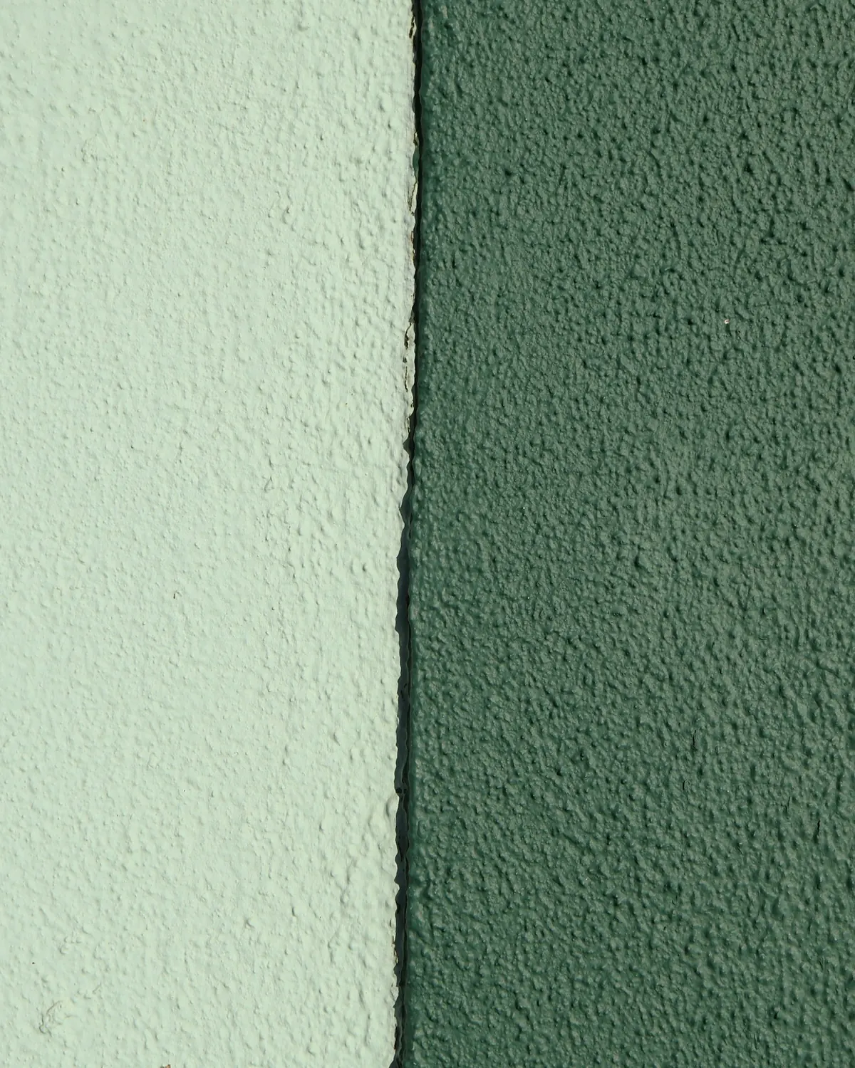
I began with a few paint samples. There was a pale beige I could imagine explaining to anyone. A warm gray that seemed unlikely to offend a single piece of furniture.
And a deep, muted green. Not bright green. Not the color of a freshly watered lawn. Something closer to an olive leaf in shadow, with a little gray in it.
I held the sample against the wall. Then against the doorframe. Then beneath the window.
In the morning, it looked soft. In the afternoon, surprisingly deep. Under the table lamp, it became warmer and more intimate.
I didn't choose it immediately. I left the sample there and went about my day.
That was the first lesson: a color should have to live with you for a while before you ask it to live on every wall.
Friday, 6:40 p.m.A name for the feeling
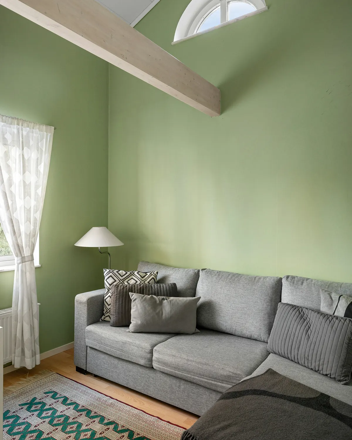
I eventually discovered the term color drenching.
The idea is simple, though the result can be striking: walls, trim, doors, and sometimes the ceiling are painted in one continuous color. Rather than outlining every architectural element in contrasting white, the color connects them.
The room becomes less a collection of separate surfaces and more a single visual environment.
For me, the interesting part wasn't its popularity. It was the possibility of making an ordinary room feel more intentional without replacing a single piece of furniture.
Small rooms should always be painted in pale colors.
Dark colors can make a room feel more enclosed, which may or may not be what you want. Painting adjoining surfaces the same color reduces strong visual divisions. Neither effect is guaranteed to make a room feel larger.
I wasn't trying to create the illusion of extra square footage anymore. I wanted the room to feel complete.
Saturday, 8:30 a.m.The morning of the decision
I moved the chair into the hallway. The little table followed. Then the books, the lamp, and the framed drawing that had been leaning against the wall for so long it seemed to belong to the architecture.
Suddenly, the room looked enormous. Apparently, removing every object is one way to achieve a spacious interior. Not an especially practical long-term solution, though.
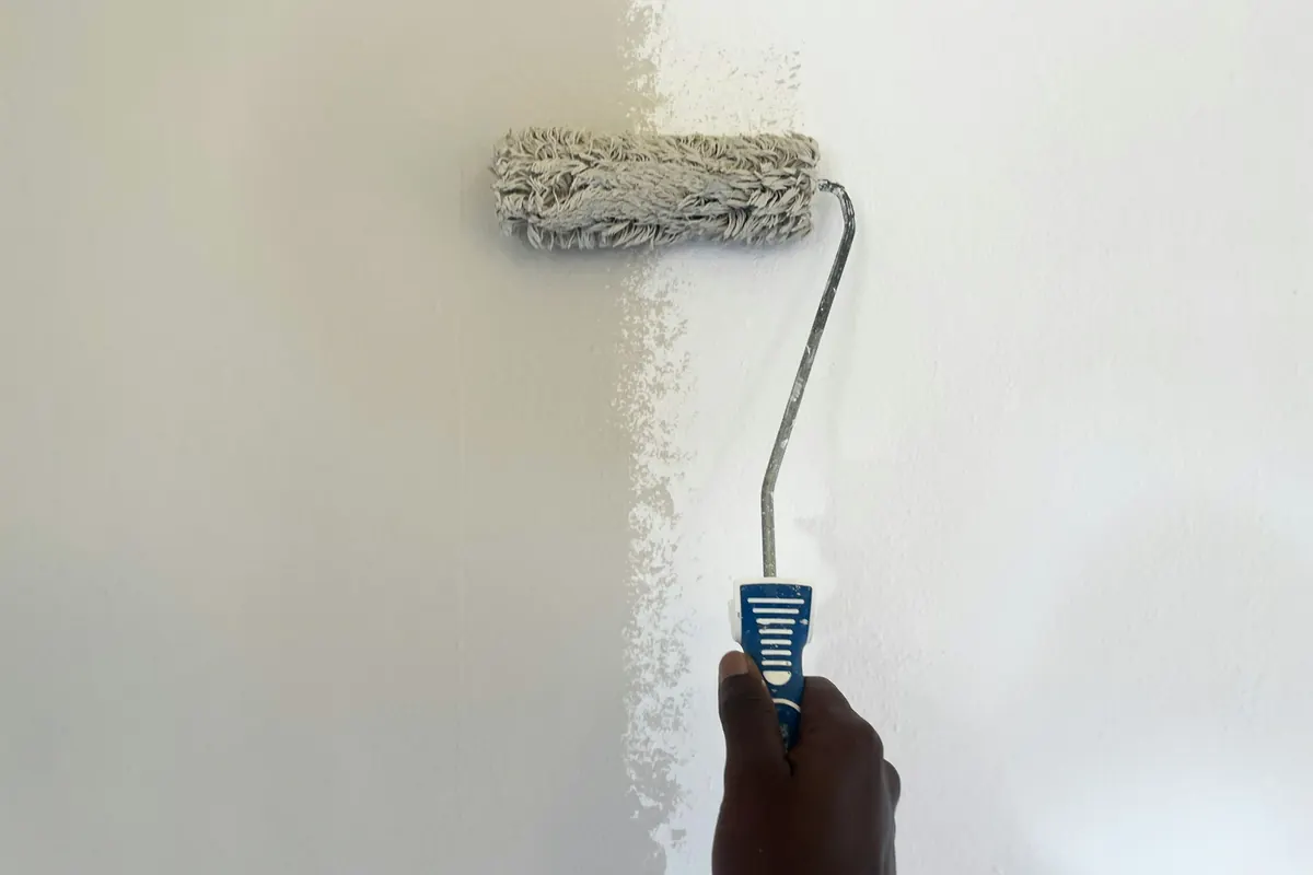
I protected the floor and prepared the surfaces. Painting an entire room is not quite the spontaneous adventure it looks like in short videos. Different surfaces can require different preparation, primers, and finishes.
Ventilation matters, too. I followed the paint instructions and kept fresh air moving through the room during the work and afterward.
I had already checked that I was allowed to paint. In a rented home, that question should come before opening a can.
Then I looked up. The ceiling was waiting.
Saturday, 12:10 p.m.The moment the white disappeared
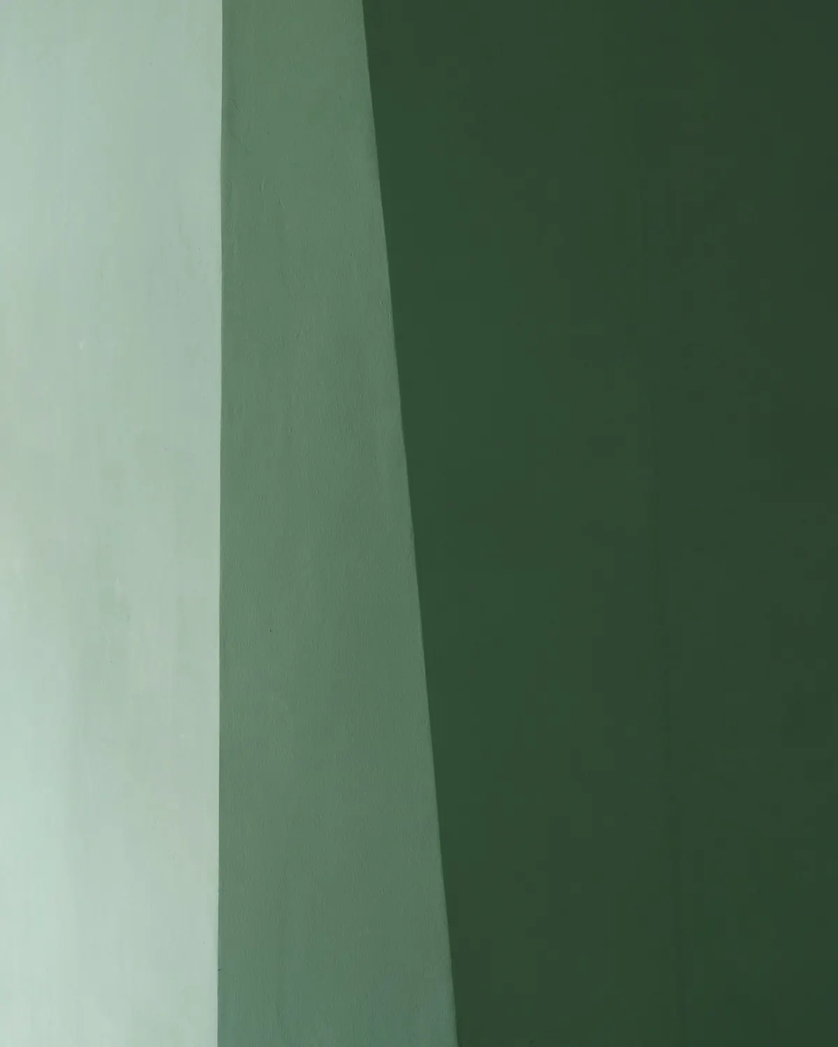
The first painted wall looked surprisingly ordinary. It was still a wall. Just green.
The second changed something. By the time the color continued around the corners, onto the trim, and eventually across the ceiling, the room began to feel different.
The window seemed more distinct. The furniture I had removed was suddenly very much missed.
And the ceiling? I had worried it would become oppressive. Instead, in this particular room, I liked the sense of continuity. The corners didn't disappear. The room didn't become magically larger. But I stopped noticing each painted surface as a separate decision.
- 01Choosing a color from a screen. Screens and room lighting change how a shade appears. Test a real sample and look at it at different times.
- 02Forgetting the ceiling. Painting only the walls can be beautiful, but it won't achieve the same continuous effect.
- 03Using the wrong finish. Walls, trim and doors may need different products or finishes. The same color can vary subtly in sheen without losing its unity.
- 04Rushing the preparation. Cleaning, repairs, priming, drying times and ventilation matter more than a flawless photograph of the result.
Sunday, 10:20 a.m.The room without its furniture
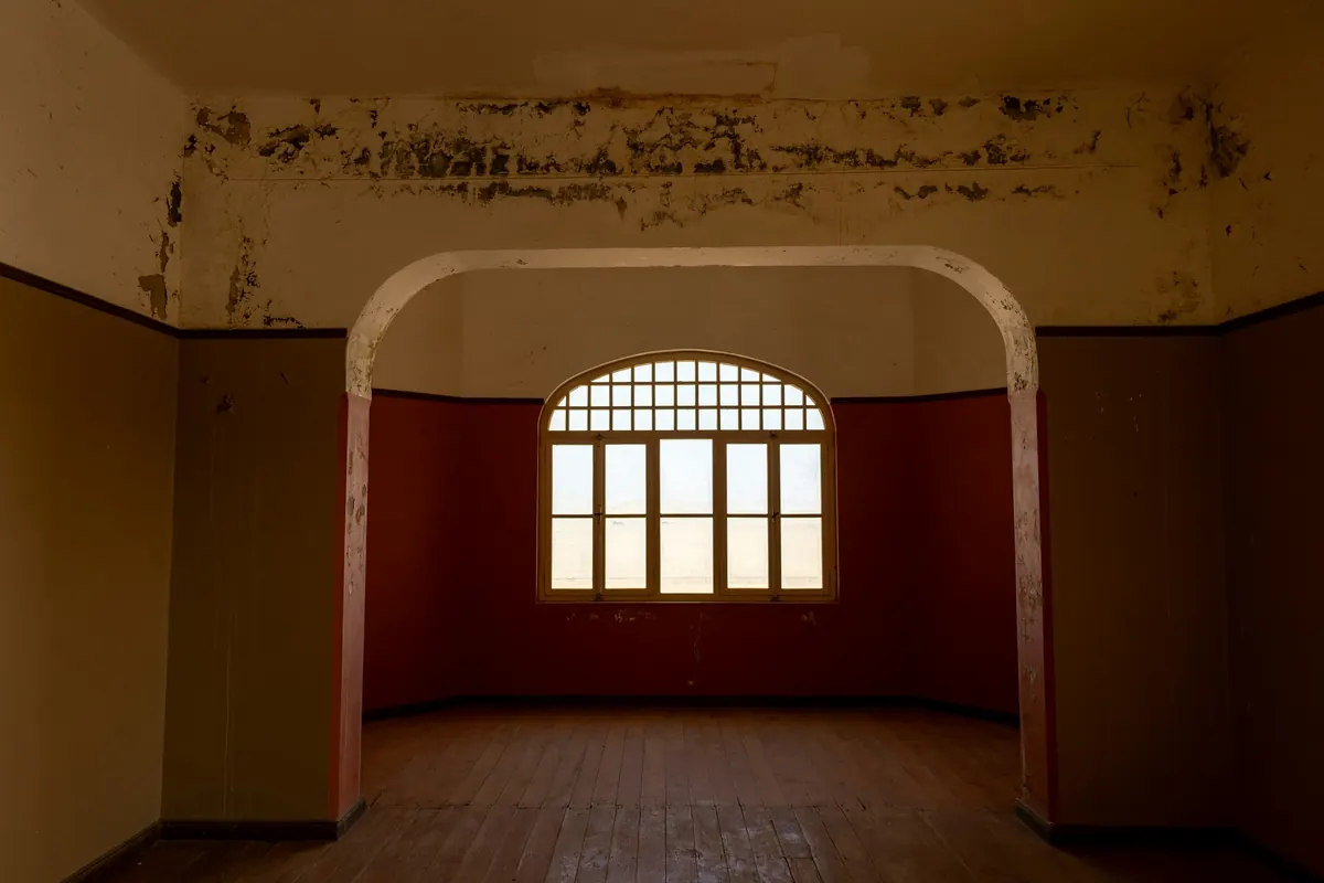
I came back when the surfaces were ready to be handled according to the paint instructions.
The room was quiet. There was no dramatic reveal, no music, no cinematic opening of curtains. Just a green room.
And I loved how unremarkable that felt.
The doorway had become a beautiful frame. The wood floor stood out against the painted walls. The window brought in a patch of light that seemed almost decorative.
I had expected the color to be the main character. Instead, it made me notice everything else.
Sunday, 4:50 p.m.Moving the old things back
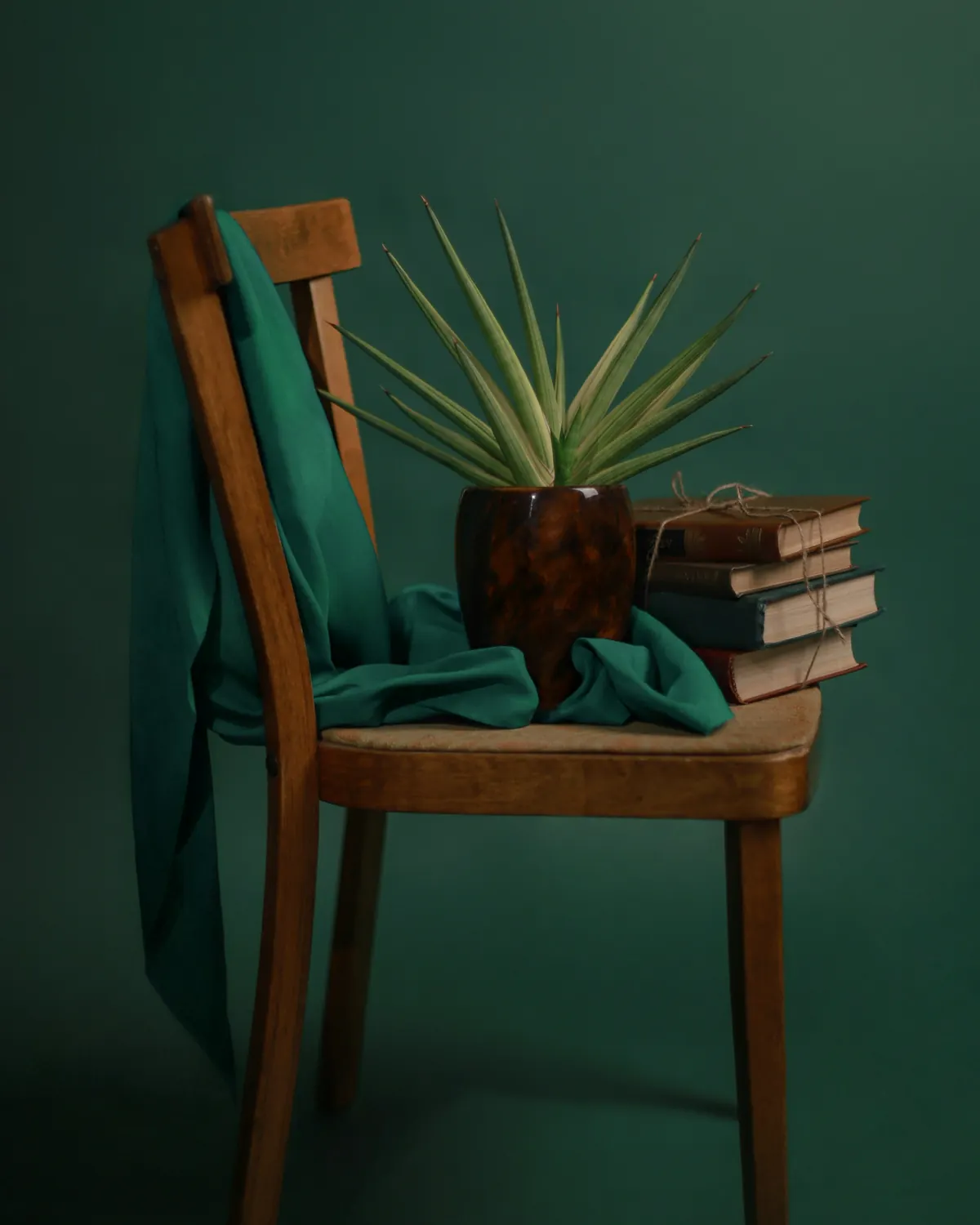
The chair returned first. Its familiar wooden arms looked warmer against the green.
Then came the little table, a stack of books, and the lamp I had been considering replacing. I didn't replace it. I moved it closer to the chair.
A pale linen cushion, previously almost invisible against the old walls, suddenly mattered. So did the framed drawing.
I had changed the background, not the story. And the story was still mine.
A color-drenched room needs matching furniture, curtains and accessories.
The technique concerns the architectural surfaces. Textiles, wood, books, art and furniture can provide contrast, and those differences are what keep a single-color room feeling personal.
Monday, 8:05 p.m.The room after dark
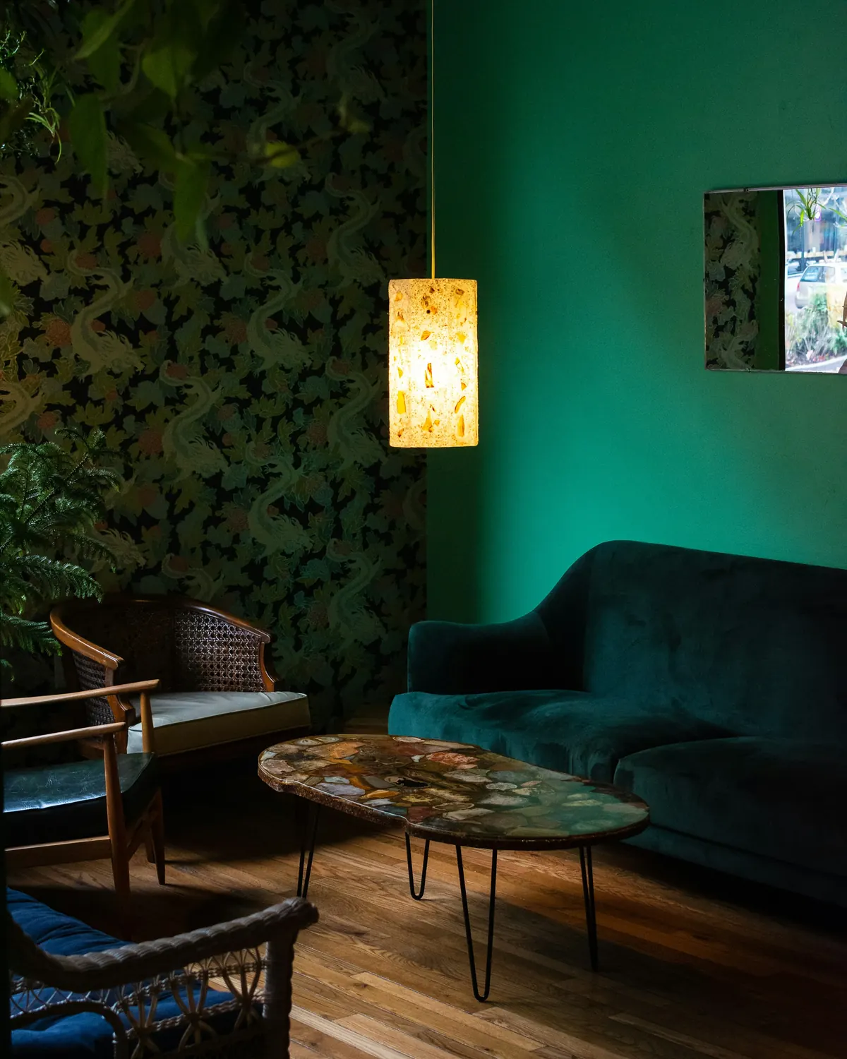
This was the test I hadn't planned.
Under the lamp, the green became deeper. The wall behind the chair receded. The books seemed to occupy a more deliberate place.
I sat down and read. Then I made tea. Then I stayed.
For the first time in months, I wasn't thinking about what the room needed next. I was simply enjoying being in it.
I thought I was giving the room a new color. I was really giving myself a new way to notice it.
Before you paintA letter to your own room
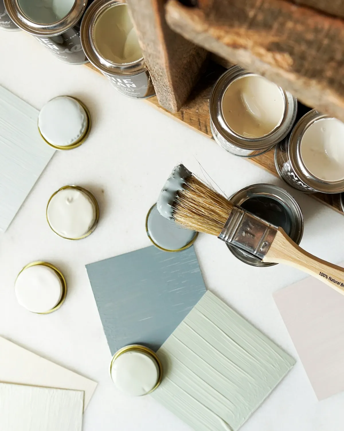
You don't have to reach for a brush tomorrow. Start by asking your room five questions.
- 1What do I actually do here?
Read, work, rest, talk, get dressed?
- 2What already deserves attention?
A window, a wooden chair, an old piece of art?
- 3How does the daylight move?
Look in the morning, afternoon, and evening.
- 4Would I enjoy feeling enclosed?
Some rooms benefit from intimacy; others need visual openness.
- 5Am I prepared for the work?
Confirm permission, suitable products, surface conditions, ventilation, and the time required.
If you decide to paint, test the color in the actual room. Consult product instructions and qualified help for unfamiliar surfaces or older coatings.
And if you can't paint, explore a coordinated palette through removable textiles and objects. It isn't technically color drenching, but it can offer some of the same feeling of cohesion.
One week laterDear room, again
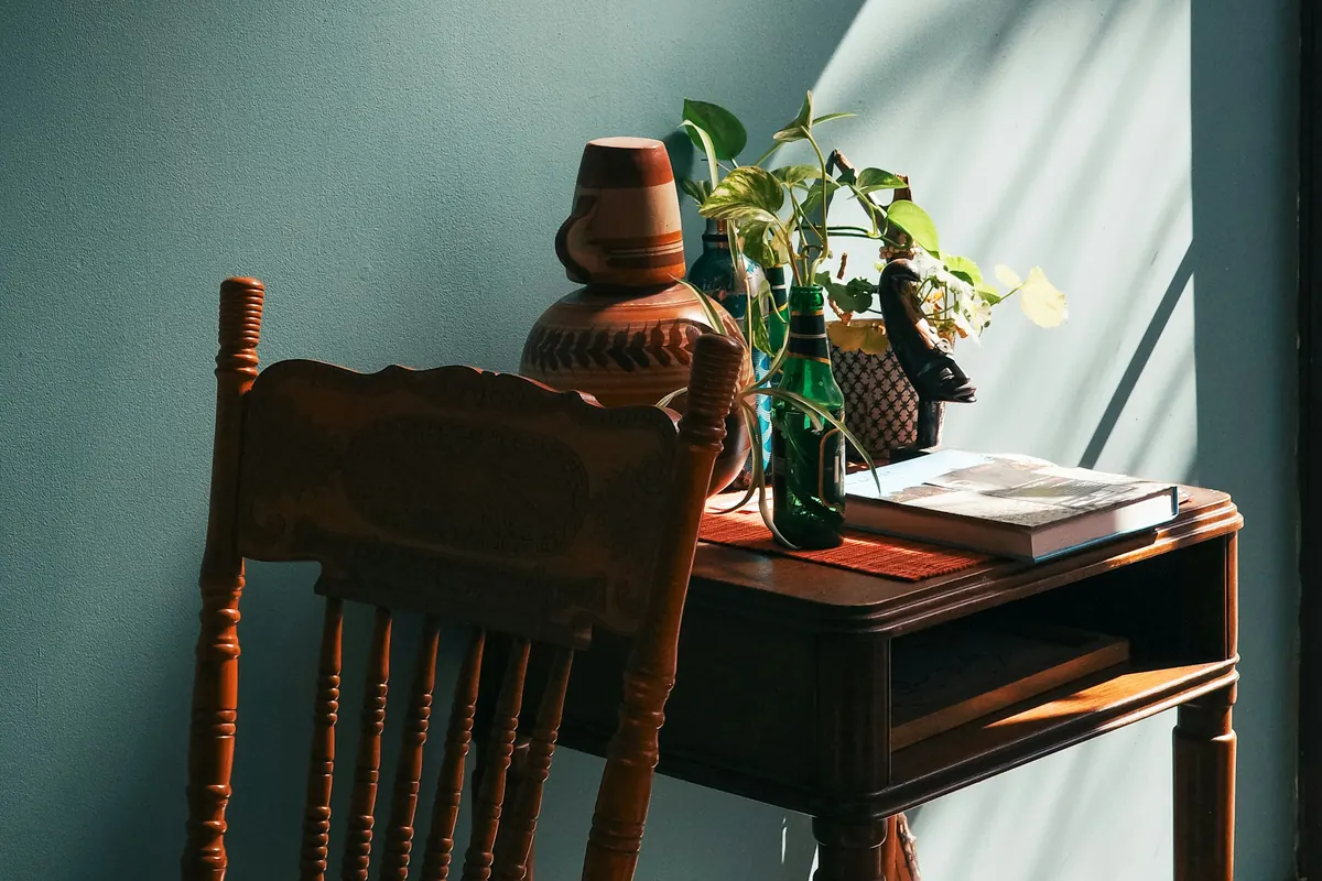
The cup is back on the table. A sweater is hanging over the chair, and the books have already stopped looking arranged.
The room has returned to ordinary life. That's the part I like best.
The color didn't turn it into a different person's home. It didn't make the furniture new or solve every awkward corner. It simply gave the room a clearer identity.
If you love this idea of finding beauty in the spaces you already inhabit, you may enjoy our story about the Paris apartment and the things that make a home personal.
Dear little room, I was wrong about you.
You didn't need to be bigger. And you certainly didn't need another shelf.
You just needed me to stop treating you as a problem.
With affection,
the person who almost painted you white.
Sources & notes
- 1stDibs, 2026 Interior Design Trends Survey: 35% of 468 designers named color drenching a rising trend. Designers' views, not household adoption or paint sales.
- Painting safety: follow product instructions and ventilate, as advised by the U.S. EPA.
- The narrator, the room and the timeline are original editorial fiction, not a testimonial. The photos are an editorial interpretation from different homes, not a documented makeover.
- Photos (Unsplash License): Steven Weeks, Clay Banks, Jerry Wei, Lisa Anna, Julee Juu, Jörg Hamel, Karolina De Costa, H&CO, Andrew Itaga, Andreia Cunha.
Querida habitación:
Te debo una disculpa.
Hace meses que digo que sos complicada. Demasiado chica para ser un living. Demasiado incómoda para funcionar como escritorio. Demasiado oscura por las tardes, aunque esa ventana tuya hace un esfuerzo bastante digno.
Cambié el sillón de lugar tres veces. Probé otras cortinas. Me quedé parada en la puerta, café en mano, pensando si una biblioteca más podría solucionar algo.
Y cada vez que consideraba pintarte, llegaba a la misma respuesta.
Blanco.
Hasta que una mañana, mientras la cafetera hacía ruido en la cocina y una franja de sol atravesaba el piso, se me ocurrió una pregunta diferente.
¿Y si no necesitabas más claridad? ¿Y si necesitabas un poco más de personalidad?
Jueves, 9:15El verde que no podía dejar de mirar
Empecé con algunas muestras de pintura. Había un beige suave, de esos que podemos justificar frente a cualquiera. Un gris cálido que probablemente no iba a discutir con ningún mueble.
Y un verde profundo, apagado. No un verde brillante. Tampoco el verde de un jardín recién regado. Más parecido a una hoja de olivo en sombra, con un poco de gris.
Apoyé la muestra contra la pared. Después junto al marco de la puerta. Más tarde, cerca de la ventana.
A la mañana parecía tranquilo. A la tarde era mucho más intenso. Con la lámpara encendida se volvía cálido, casi íntimo.
No lo elegí enseguida. Lo dejé ahí durante el día.
Y aprendí algo: antes de pedirle a un color que ocupe toda tu habitación, conviene darle tiempo para convivir con vos.
Viernes, 18:40Ponerle nombre a una idea
Así llegué al concepto de color drenching.
La idea es bastante sencilla, aunque el resultado puede sorprender: pintar paredes, zócalos, marcos, puertas y, en su versión más completa, también el techo de un mismo color. En lugar de marcar cada elemento arquitectónico con blanco, el color los conecta.
La habitación deja de sentirse como una suma de superficies y empieza a percibirse como un conjunto.
A mí lo que me interesaba no era seguir una moda. Era la posibilidad de darle identidad a un ambiente común sin reemplazar ninguno de sus muebles.
Los espacios pequeños siempre deberían pintarse de colores claros.
Los tonos oscuros pueden crear una sensación más envolvente, que puede gustarte o no. Usar el mismo color en paredes y molduras reduce los contrastes que marcan los límites. Nada de eso garantiza que una habitación parezca más grande.
De hecho, dejé de buscar metros cuadrados imaginarios. Quería un espacio que se sintiera completo.
Sábado, 8:30El día de la decisión
Saqué el sillón al pasillo. Después la mesita. Los libros, la lámpara y ese cuadro apoyado contra la pared desde hacía tanto tiempo que ya parecía formar parte de ella.
De golpe, la habitación se veía enorme. Aparentemente, sacar absolutamente todo es una excelente manera de ganar amplitud. Lástima que no sea demasiado práctico para vivir.
Protegí el piso y preparé las superficies. Pintar una habitación entera no es tan espontáneo como parece en los videos cortitos. Cada superficie puede necesitar una preparación, una base o una terminación diferente.
También cuidé la ventilación, siguiendo las instrucciones de la pintura y dejando circular aire fresco durante el trabajo y después.
Antes de empezar, ya había comprobado que podía pintar. Si alquilás, esa pregunta viene antes de abrir la lata.
Entonces levanté la cabeza. Ahí estaba el techo, esperando.
Sábado, 12:10Cuando el blanco empezó a desaparecer
La primera pared terminada no parecía gran cosa. Seguía siendo una pared. Solo que verde.
Con la segunda pasó algo distinto. A medida que el color continuaba por las esquinas, los zócalos y finalmente el techo, la habitación empezaba a cambiar.
La ventana parecía más definida. Los muebles que había sacado empezaban a hacer falta.
¿Y el techo? Me había preocupado que quedara demasiado pesado. Pero en esta habitación me gustó la continuidad. Las esquinas no desaparecieron. El espacio tampoco creció mágicamente. Simplemente dejé de mirar cada superficie como una decisión separada.
- 01Elegir el color desde una pantalla. Los monitores y la iluminación alteran nuestra percepción. Probá una muestra real y mirala en distintos momentos del día.
- 02Olvidarse del techo. Pintar solamente las paredes puede quedar hermoso, pero no produce la misma continuidad visual.
- 03Usar cualquier terminación. Paredes, puertas y zócalos pueden necesitar productos o acabados diferentes. Un mismo tono puede convivir con distintos grados de brillo.
- 04Apurarse con la preparación. La limpieza, las reparaciones, la imprimación, los tiempos de secado y la ventilación importan más que la fotografía final.
Domingo, 10:20Una habitación sin muebles
Volví a entrar cuando las superficies ya podían manipularse según las indicaciones de la pintura.
Todo estaba en silencio. No hubo una revelación espectacular, ni música, ni una apertura cinematográfica de cortinas. Solo una habitación verde.
Y me encantó que se sintiera tan normal.
La puerta se había convertido en un marco precioso. El piso de madera contrastaba con las paredes. La ventana dejaba entrar un pedazo de luz que parecía colocado ahí con toda intención.
Pensé que el color iba a ser el gran protagonista. Pero terminó haciendo que prestara más atención a todo lo demás.
Domingo, 16:50El regreso de las cosas conocidas
El sillón volvió primero. Sus apoyabrazos de madera se veían más cálidos sobre el fondo verde.
Después regresaron la mesita, algunos libros y esa lámpara que hacía tiempo pensaba cambiar. No la cambié. La acerqué al sillón.
Un almohadón de lino claro, que antes pasaba completamente inadvertido, encontró un nuevo protagonismo. Lo mismo pasó con el cuadro.
Había cambiado el fondo, no la historia. Y la historia seguía siendo mía.
En una habitación de un solo color, muebles, cortinas y accesorios también tienen que ser del mismo tono.
El color drenching se concentra en las superficies arquitectónicas. Los muebles, los textiles, el arte, los libros y la madera pueden aportar contraste, y esas diferencias ayudan a que el ambiente conserve personalidad.
Lunes, 20:05La habitación después del atardecer
Esta fue la prueba que no había planeado.
Con la lámpara encendida, el verde se volvió más profundo. La pared detrás del sillón parecía retirarse un poquito. Los libros encontraban su lugar con una naturalidad nueva.
Me senté a leer. Después preparé un té. Y me quedé un rato más.
Por primera vez en meses, no estaba pensando qué le faltaba a esa habitación. Simplemente tenía ganas de estar ahí.
Pensé que estaba cambiando el color de una habitación. En realidad, estaba aprendiendo a mirarla de otra manera.
Antes de pintarEscribile una carta a tu habitación
No hace falta que mañana salgas a comprar pintura. Primero, hacé cinco preguntas.
- 1¿Qué hago realmente acá?
¿Trabajo, descanso, leo, recibo visitas?
- 2¿Qué merece más protagonismo?
¿Una ventana, una silla antigua, una biblioteca, un cuadro?
- 3¿Cómo se mueve la luz?
Observá el ambiente a la mañana, durante la tarde y de noche.
- 4¿Me gusta sentirme rodeada por el color?
Hay quienes disfrutan los espacios íntimos y quienes prefieren una sensación más abierta.
- 5¿Estoy preparada para el trabajo?
Confirmá permisos, productos adecuados, estado de las superficies, ventilación y tiempo disponible.
Si decidís pintar, probá el color en la habitación real. Seguí las instrucciones del fabricante y consultá a profesionales ante superficies desconocidas o revestimientos antiguos.
Y si no podés pintar, podés explorar una paleta coordinada con textiles y objetos removibles. No es color drenching propiamente dicho, pero permite experimentar una sensación parecida de unidad.
Una semana despuésQuerida habitación, otra vez
La taza volvió a quedar sobre la mesa. Hay un suéter colgado del sillón y los libros ya perdieron ese aspecto de haber sido acomodados cuidadosamente.
La habitación volvió a la vida cotidiana. Y eso es lo que más me gusta.
El color no la convirtió en la casa de otra persona. No hizo que los muebles parecieran nuevos ni resolvió todas las esquinas incómodas. Simplemente le dio una identidad más clara.
Si te interesa esta forma de descubrir belleza en los espacios que ya habitamos, te puede gustar nuestro artículo sobre el departamento parisino y las cosas que hacen que una casa sea personal.
Querida habitación, estaba equivocada con vos.
No necesitabas ser más grande. Y definitivamente no necesitabas otra biblioteca.
Solo necesitabas que dejara de mirarte como un problema.
Con cariño,
la persona que casi te pintó de blanco.
Fuentes y notas
- 1stDibs, encuesta 2026 Interior Design Trends: el 35 % de 468 diseñadores señaló el color drenching como tendencia en crecimiento. Son opiniones de diseñadores, no datos de hogares ni de ventas.
- Seguridad al pintar: seguir las instrucciones del producto y ventilar, como recomienda la EPA de EE. UU.
- La narradora, la habitación y los días son ficción editorial, no un testimonio. Las fotos son una interpretación visual de casas distintas, no el registro de una reforma.
- Fotos (licencia de Unsplash): Steven Weeks, Clay Banks, Jerry Wei, Lisa Anna, Julee Juu, Jörg Hamel, Karolina De Costa, H&CO, Andrew Itaga, Andreia Cunha.