It's 4:36 on a Sunday afternoon.
The windows are open just enough to hear the street. Someone has left a burgundy sweater across the back of an old wooden chair. On the dining table, a bowl of pears sits beside a stack of books.
The sweater doesn't match the cushions. The wood isn't the same shade as the floor. None of this was planned.
And somehow, the room looks better than it did an hour ago.
Perhaps it's the contrast. Perhaps it's the afternoon light. Or perhaps it's simply that a little color has made an ordinary room feel less anonymous.
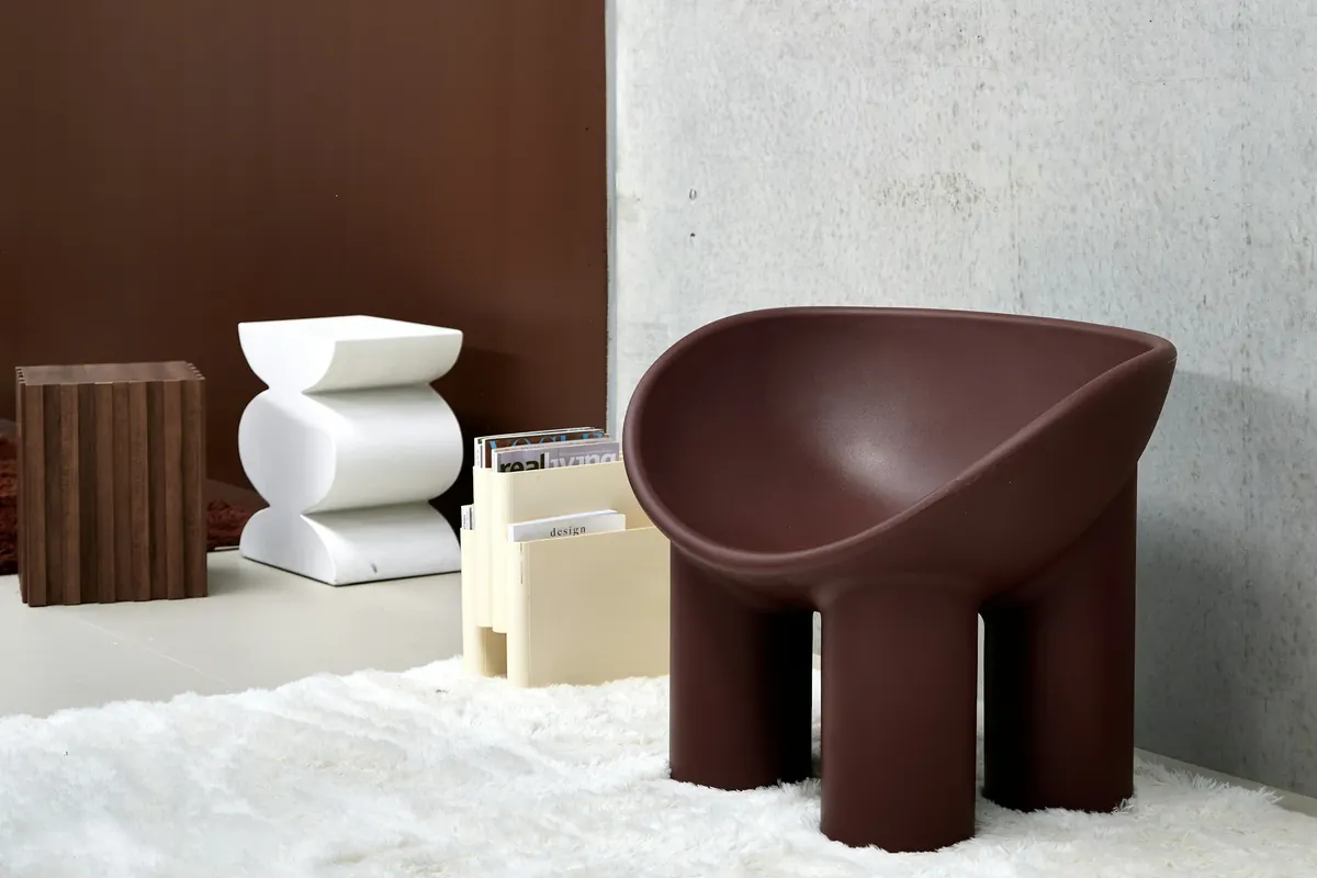
Chocolate brown and burgundy are returning to the design conversation. But their real appeal isn't that they're fashionable. It's that they can make a home feel grounded, expressive, and beautifully personal.
Two colors, two different personalities
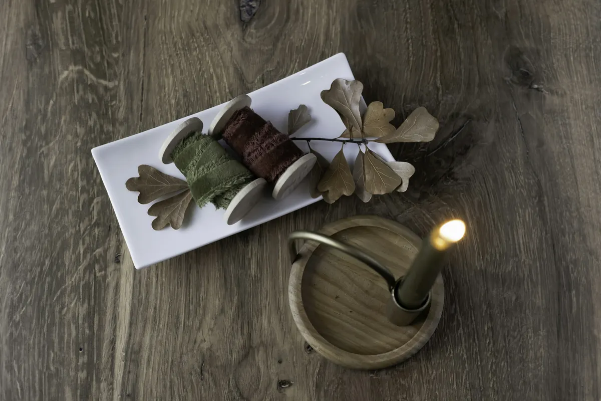
Chocolate brown has a quiet kind of confidence. It can appear in a wooden table, a leather chair, an old picture frame, or a ceramic bowl. It's deep without necessarily being dramatic, and it works particularly well alongside materials that have visible texture.
Burgundy behaves differently. A little can become the most memorable detail in a room: a book cover, a velvet cushion, a piece of glassware, or the fabric of a chair you've owned for years.
One color tends to settle into a space. The other catches your eye. Together, they can be wonderfully interesting, provided they have room to breathe.
These are designers' reported preferences and expectations, not measurements of what people are buying for their homes. The interesting question isn't whether we should follow the trend. It's what these colors might help us notice.
Before choosing a palette, look around
Every room already has a color story, even when we describe it as neutral: the wood of the table, the undertone of the floor, the color of the curtains, the books, the objects we hardly notice anymore.
Start there. Put a burgundy garment beside your sofa. Bring a dark brown bowl onto a pale shelf. Move an existing cushion into another room.
Don't decide immediately whether you like the result. Look again in daylight and after the lamps come on.
Color doesn't exist independently of everything around it. Its character changes with its neighbors. And that's where the fun begins.
Five palettes worth trying
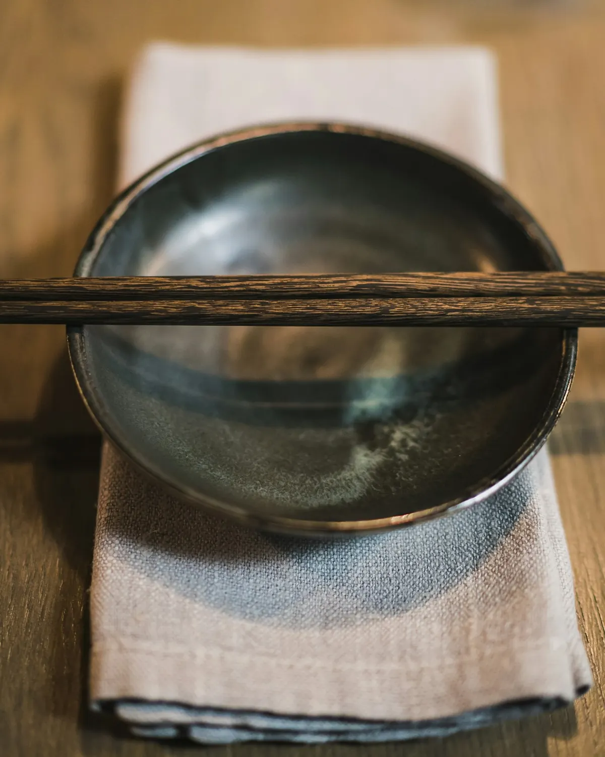
Chocolate + oat + natural linen
Quiet, tactile, unhurried. Deep brown beside oatmeal fabric creates a gentle contrast. Try a dark wooden table, a light cloth, and the everyday objects you already leave on it.
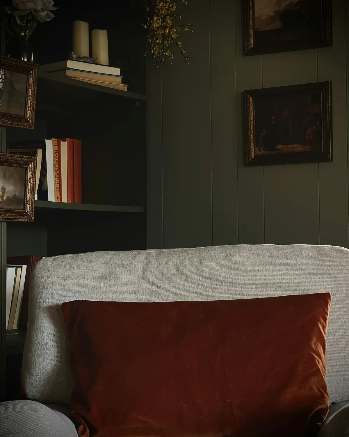
Burgundy + warm white + walnut
Collected, quietly expressive. One small accent can be more effective than filling the room with the same shade. Try a burgundy book, textile or vessel near an existing wooden piece.
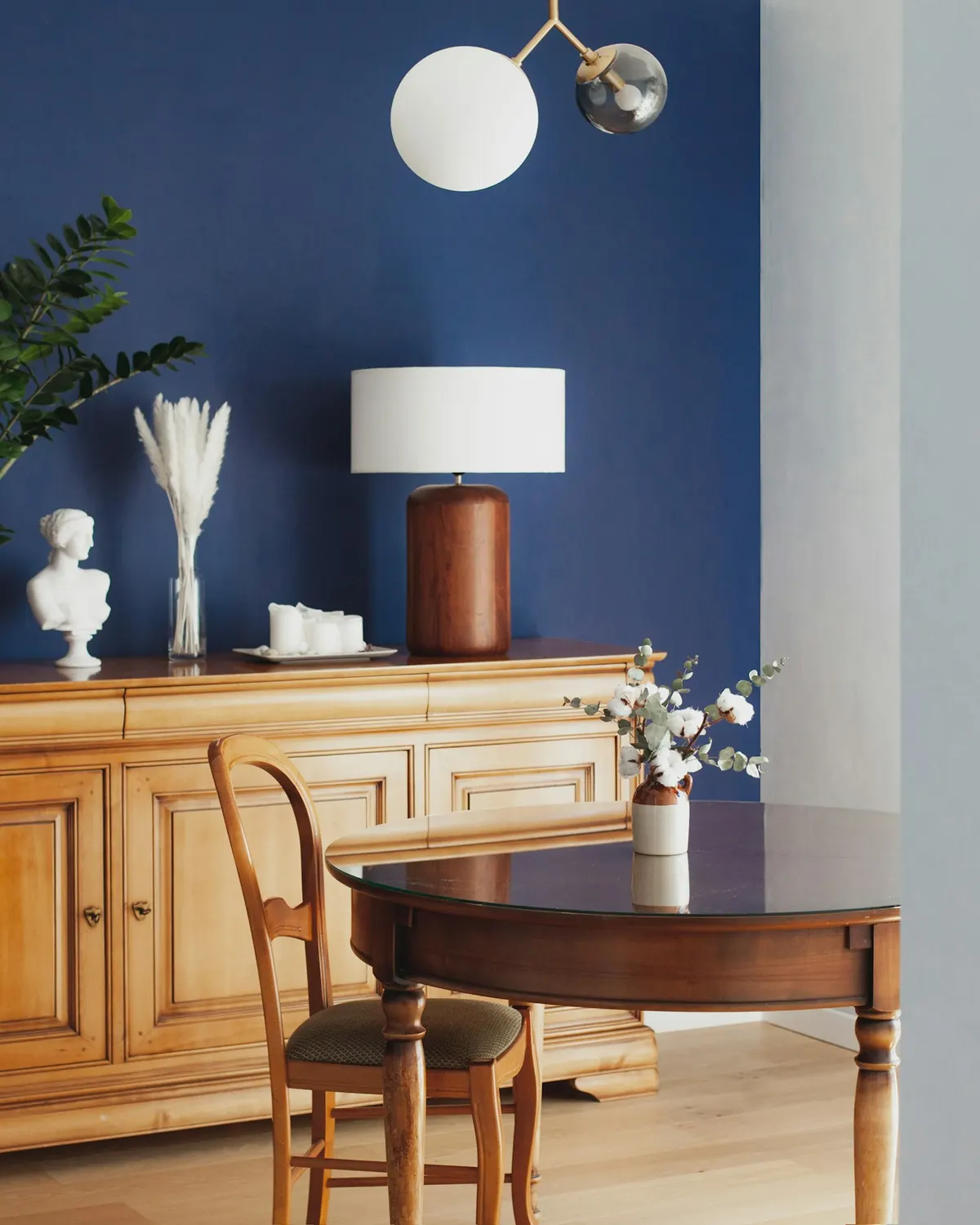
Chocolate + powder blue + ivory
Unexpected, fresh, a little playful. Soft blue introduces contrast without feeling formal. Try a blue book, faded fabric, or small artwork beside darker furniture.
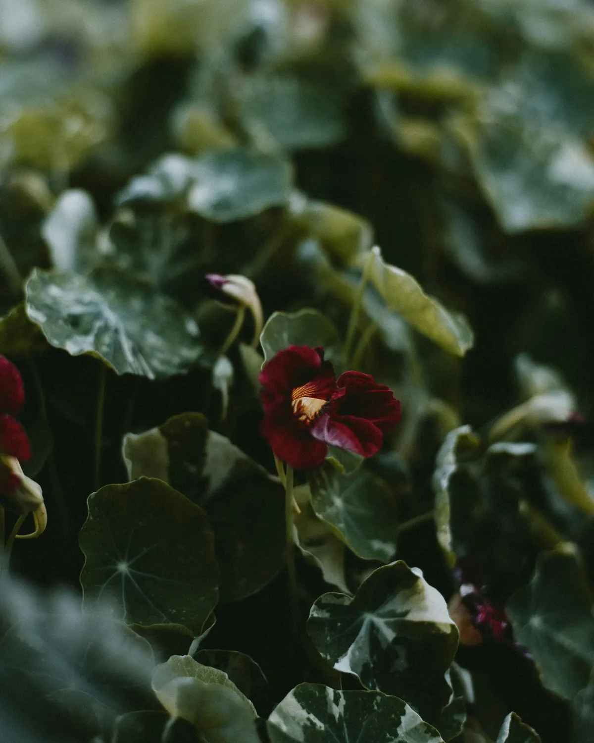
Burgundy + olive + natural wood
Intimate, botanical, full of character. Light wood or pale fabric keeps it from feeling heavy. Try a burgundy fabric detail beside an olive-toned object or a leafy plant.
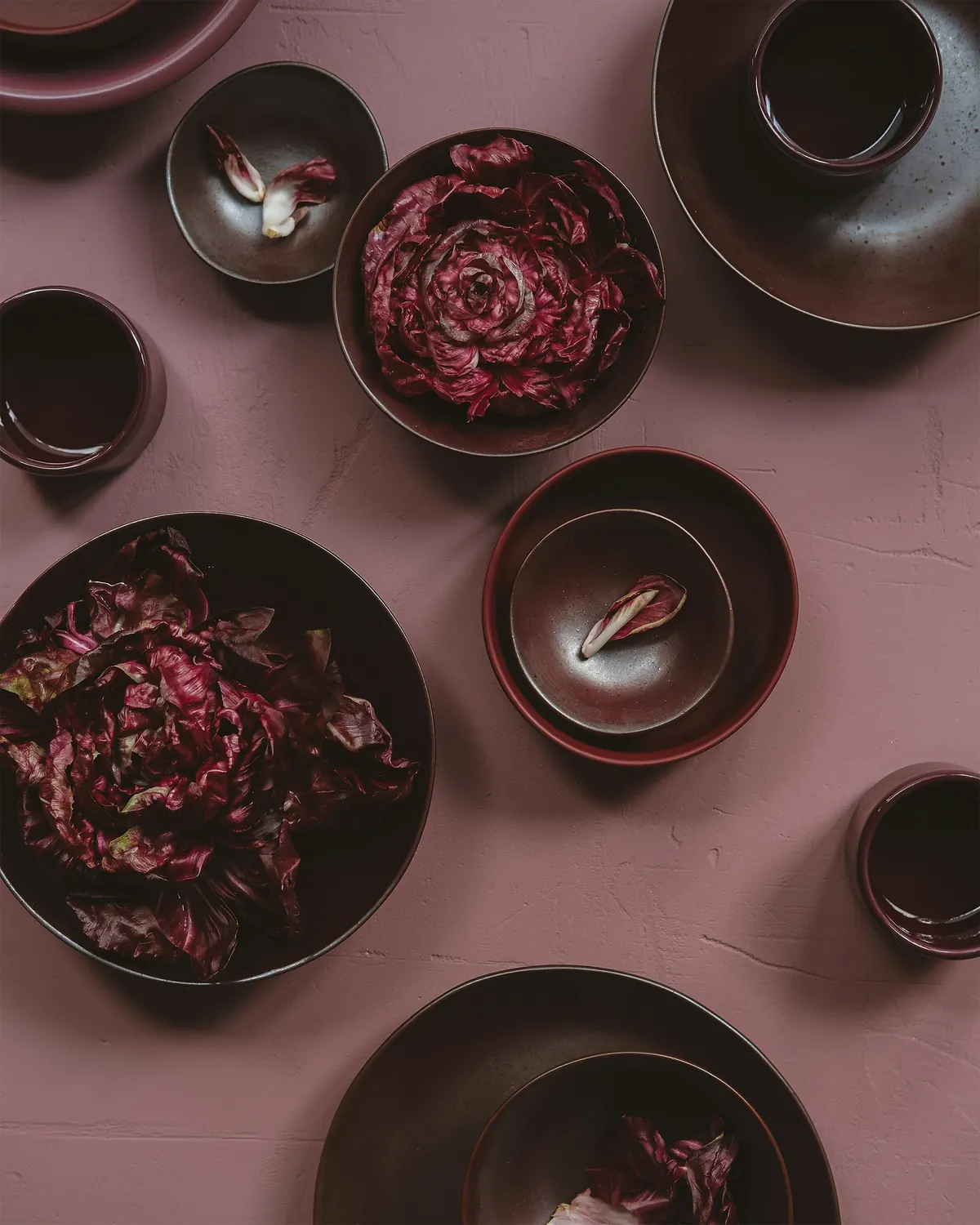
Chocolate + burgundy + soft pink
Romantic without being precious. Brown gives depth, burgundy intensity, and a restrained dusty pink a softer contrast. Try a dark wooden surface, one burgundy accent and a pale pink textile or flower.
Background color or accent color?
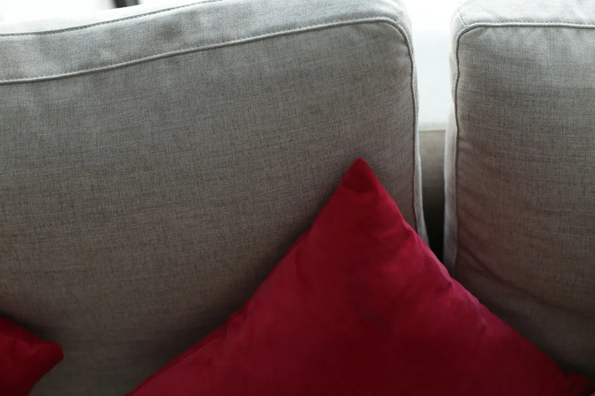
This isn't a test of good taste. It's a quick way to notice how you prefer to live with color.
The before and after without a renovation
Imagine a living room with a light sofa, a wooden coffee table, and cream curtains.
Before: The room is pleasant, but everything seems to occupy the same visual register. Nothing particularly catches your attention.
After: A dark wooden bowl moves from the kitchen to the coffee table. A burgundy throw comes out of the closet. A pale cushion stays exactly where it was.
The room hasn't become dramatically different. It's simply gained a rhythm: something light, something deep, something that draws the eye.
There was no paint, no new furniture, and no grand design intervention. Just a better conversation between objects.
Color doesn't have to transform your home. Sometimes it simply helps you recognize what was already beautiful.

Your 15-minute color edit
- 1Find your darkest object.
It might be a wooden bowl, a picture frame, or a book.
- 2Give it contrast.
Put it beside something lighter, preferably in a different texture.
- 3Add one color.
Try burgundy, muted green, dusty pink, or another shade you already own.
- 4Remove one thing.
Leave enough space for the composition to breathe.
- 5Check it twice.
Look in daylight, then again under the lighting you normally use in the evening.
If the combination feels right, keep it. If it doesn't, return the objects to their previous places. You haven't failed a decorating exercise. You've learned something about your own taste.
A note about trends and real homes
There's no reason every room should turn chocolate brown this year.
Deep colors can feel beautiful in one space and overwhelming in another. The amount of daylight, the materials, the size of the room, and your personal preferences all matter.
And a color doesn't need to be new to become interesting again. Maybe your home already has a walnut table, a burgundy cushion, or an old wooden frame.
What changes isn't the object. It's the attention you give it.
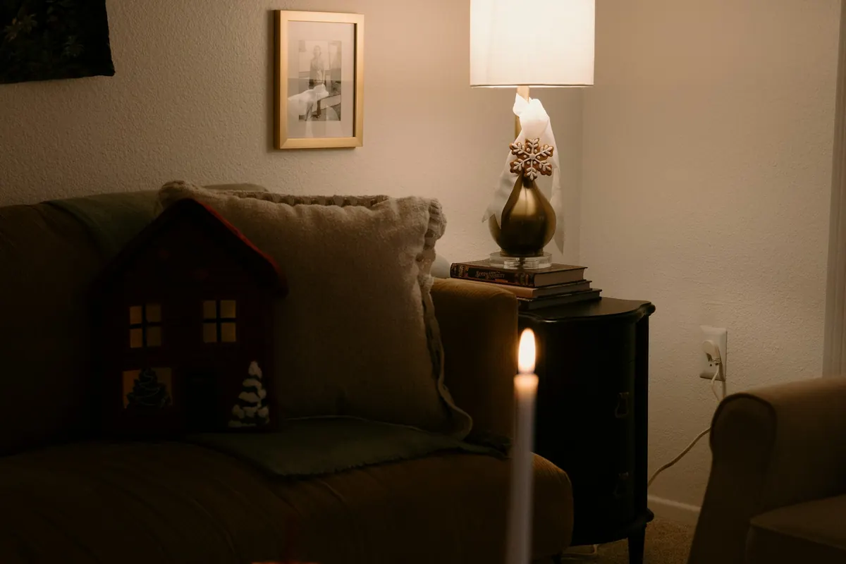
In the evening, the room from our opening scene is almost dark.
The sweater is still on the chair. The pears have been moved into the kitchen. Someone has switched on a small lamp beside the sofa.
Nothing matches perfectly. Nothing needs to.
If you enjoy homes that reveal their character through familiar objects, our story about the Paris apartment and the art of living with what you have explores the same idea from another angle.
Perhaps that's the lasting appeal of chocolate and burgundy. Not that they're back in fashion, but that they remind us how much beauty can live in the colors we've been looking at for years.
Sources & notes
- 1stDibs, 2026 Interior Design Trends Survey (468 design professionals; published November 17, 2025). Percentages are designers' answers, not sales or market share.
- The palettes, scenes and test are original ORIGIN proposals; we attribute no universal psychological effects to color. Swatches are illustrative, not paint codes.
- Photos (Unsplash License): Melody Zimmerman, Juan Encalada, Emily Irene Photo Co., MChe Lee, 360floralflaves, Elena Popova, Neon Wang, Heather Newsom, Erica Marsland Huynh, Jason Leung.
Son las cuatro y treinta y seis de un domingo.
Las ventanas están apenas abiertas y se escucha algo del movimiento de la calle. Alguien dejó un suéter bordó sobre el respaldo de una silla vieja de madera. En la mesa del comedor hay un frutero con peras y unos libros apilados.
El suéter no combina con los almohadones. La madera de la silla tiene otro tono que el piso. Nadie pensó demasiado en cómo iba a quedar todo junto.
Y, sin embargo, el ambiente se ve más lindo que hace un rato.
Quizás sea el contraste. Quizás la luz de la tarde. O simplemente que un poco de color consiguió darle más personalidad a un espacio conocido.
El marrón chocolate y el bordó vuelven a aparecer con fuerza en el mundo del diseño. Pero lo interesante no es que estén de moda. Es que pueden darle profundidad, calidez y carácter a una casa que ya tiene su propia historia.
Dos colores, dos personalidades
El marrón chocolate tiene una seguridad bastante tranquila. Puede estar en una mesa de madera, un sillón de cuero, un marco antiguo o un cuenco de cerámica. Es un color profundo, pero no necesariamente dramático. Y tiene una relación muy linda con las texturas.
El bordó, en cambio, se comporta de otra manera. Un pequeño detalle puede convertirse en el protagonista del ambiente: un libro, un almohadón de terciopelo, una pieza de vidrio o la tela de una silla que tenés hace años.
Uno parece darle estabilidad a la habitación. El otro invita a mirar. Juntos pueden funcionar muy bien, siempre que les dejemos un poco de espacio.
Son preferencias y expectativas de los profesionales consultados, no porcentajes de ventas. La pregunta interesante no es si tenemos que seguir la tendencia. Es qué nos pueden ayudar a descubrir estos colores.
Antes de elegir una paleta, mirá alrededor
Todas las casas tienen una historia de color, incluso las que consideramos neutras: el tono de la mesa, el piso, las cortinas, los libros y esos objetos que vemos todos los días sin prestarles demasiada atención.
Empezá por ahí. Apoyá una prenda bordó sobre el sofá. Llevá un cuenco de madera oscura a una repisa clara. Cambiá un almohadón de ambiente.
No decidas enseguida si te gusta el resultado. Miralo durante el día y después, cuando se encienden las lámparas.
Un color no funciona de manera aislada. Cambia según los materiales, la luz y los otros colores que lo acompañan. Y ahí empieza lo divertido.
Cinco paletas para probar en tu casa
Chocolate + avena + lino natural
Calma, textura y tiempo para disfrutar. El marrón profundo junto a los tonos avena crea un contraste suave. Probalo con una mesa oscura, un mantel claro y los objetos que usás todos los días.
Bordó + blanco cálido + nogal
Sofisticación sin esfuerzo. Un solo acento puede resultar más interesante que repetir el mismo color por toda la habitación. Probalo con un libro, una tela o una pieza bordó cerca de un mueble de madera.
Chocolate + celeste empolvado + marfil
Frescura y un toque inesperado. El marrón no tiene por qué combinar siempre con colores tierra. Probalo con un libro azul, una tela gastada o una pequeña ilustración cerca de muebles oscuros.
Bordó + oliva + madera natural
Una casa con carácter. La madera clara o una tela pálida ayudan a que no resulte pesado. Probalo con un detalle textil bordó junto a un objeto verde oliva o una planta.
Chocolate + bordó + rosa viejo
Romanticismo adulto, sin excesos. El marrón aporta profundidad, el bordó intensidad y el rosa empolvado suaviza el encuentro. Probalo con madera oscura, un acento bordó y una flor o tela rosa suave.
¿Que el color acompañe o que sorprenda?
No es un examen de buen gusto. Es una manera rápida de descubrir cómo te gusta convivir con los colores.
El antes y después que no necesita obra
Imaginá un living con un sofá claro, una mesa ratona de madera y cortinas crema.
Antes: es un espacio agradable, pero todo parece tener una intensidad parecida. Nada llama especialmente la atención.
Después: llevás un cuenco oscuro de la cocina a la mesa ratona. Sacás una manta bordó del placard y dejás el almohadón claro donde estaba.
La habitación no se volvió irreconocible. Simplemente encontró otro ritmo: algo claro, algo profundo y un detalle que invita a mirar.
No hubo pintura ni muebles nuevos. Solo una conversación un poquito más interesante entre los objetos.
El color no tiene que transformar tu casa. A veces alcanza con que te ayude a descubrir lo que ya era lindo.
Quince minutos para mirar el color de otra manera
- 1Buscá tu objeto más oscuro.
Puede ser una pieza de madera, un marco o un libro.
- 2Dale contraste.
Acompañalo con algo más claro y, si podés, de otra textura.
- 3Sumá un color.
Probá con bordó, verde oliva, rosa viejo u otro tono que ya tengas en casa.
- 4Sacá una cosa.
Dejá suficiente espacio para que los objetos puedan destacarse.
- 5Miralo dos veces.
Primero con luz natural y después con las lámparas que usás normalmente.
Si te gusta, dejalo. Si no funciona, volvé a acomodar las cosas como estaban. No fallaste un ejercicio de decoración: descubriste algo sobre tus gustos.
Una tendencia no tiene que convertirse en una obligación
No hay ningún motivo para que este año todas las habitaciones se vuelvan marrón chocolate.
Los colores profundos pueden resultar hermosos en un espacio y demasiado intensos en otro. La luz natural, los materiales, las dimensiones y, sobre todo, tus preferencias cambian muchísimo la experiencia.
Además, un color no necesita ser nuevo para volver a interesarnos. Quizás tu casa ya tenga una mesa de nogal, un almohadón bordó o un marco de madera oscura.
Lo que cambia no es el objeto. Es la atención que le damos.
Al anochecer, el living del principio de nuestra historia está casi a oscuras.
El suéter sigue sobre la silla. Las peras volvieron a la cocina. Alguien encendió una lámpara pequeña junto al sofá.
Nada combina perfectamente. Y tampoco hace falta.
Si te gustan las casas que cuentan historias a través de sus objetos, podés leer también nuestro artículo sobre el departamento parisino y el arte de vivir con lo que ya tenemos.
Quizás ese sea el verdadero encanto del chocolate y el bordó. No que hayan vuelto a estar de moda, sino que nos recuerdan cuánta belleza puede haber en los colores que vemos desde hace años.
Fuentes y notas
- 1stDibs, encuesta 2026 Interior Design Trends (468 profesionales del diseño; publicada el 17 de noviembre de 2025). Los porcentajes son respuestas de diseñadores, no ventas.
- Las paletas, escenas y el test son propuestas originales de ORIGIN; no atribuimos efectos psicológicos universales a los colores. Las muestras son orientativas, no códigos de pintura.
- Fotos (licencia de Unsplash): Melody Zimmerman, Juan Encalada, Emily Irene Photo Co., MChe Lee, 360floralflaves, Elena Popova, Neon Wang, Heather Newsom, Erica Marsland Huynh, Jason Leung.