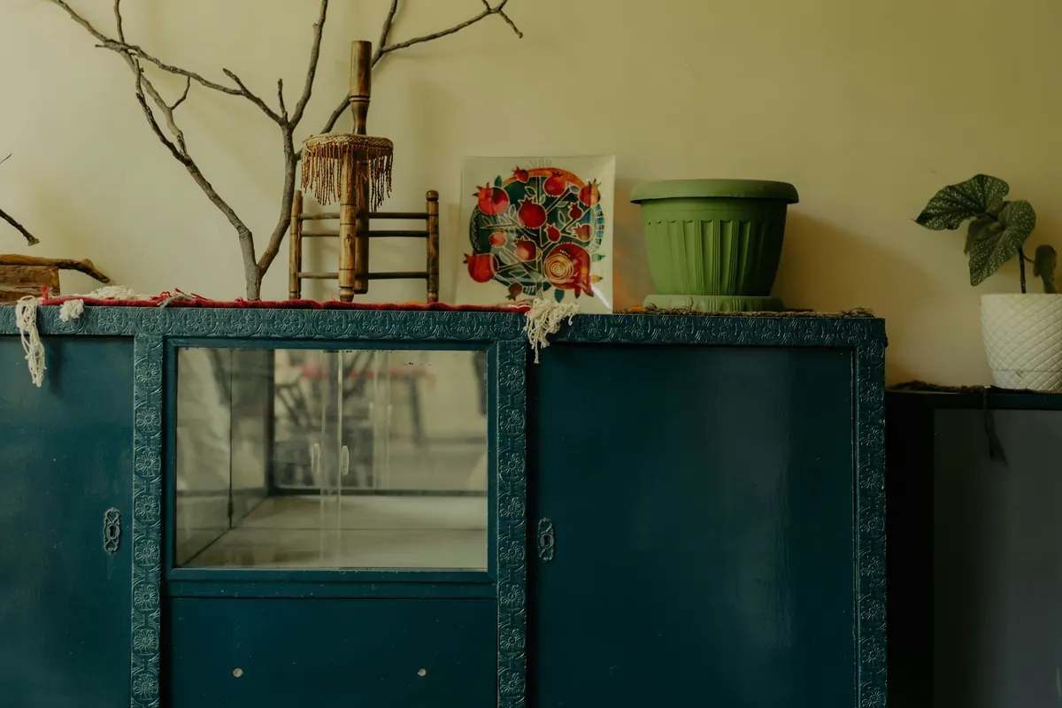
10:26A quiet Saturday morning
The living room is quiet except for the sound of a spoon against a cup. There are books on the shelf, a plant beside the window and a wooden cabinet that has been standing in the same place for years.
You've thought about changing the room. Perhaps painting one wall. Maybe introducing a stronger color somewhere. But every time you imagine a large painted surface, you hesitate. What if you get tired of it? What if it feels like too much?
Then your eyes settle on the cabinet. It's smaller than the wall. It already belongs to the room. And it might be the perfect place to begin.
Perhaps your next decorating idea doesn't need to happen on a wall at all.
The wall that doesn't need painting
A familiar design idea is being reconsidered for 2027. In its October 2026 forecast, Homes & Gardens identifies colorful storage as a new alternative to the traditional feature wall.
Instead of painting one wall to create a focal point, designers are looking at bookshelves, built-in cabinets, alcoves and freestanding furniture. The idea is to give color to something that already has a function.
A bookshelf holds books. A cabinet stores everyday objects. An alcove might display ceramics, photographs or pieces collected over time.
When these surfaces are painted, the color becomes part of the furniture and its contents, rather than sitting behind everything as a separate statement. It's an intriguing idea for anyone who wants more personality in a room without treating every wall as a blank canvas. And it doesn't require replacing the furniture.
A little color, a lot of character
The forecast includes an example from interior designer Rebecca Wakefield. In a house with traditional colors and details, she introduced an energetic orange on shelving, balancing it with more classic tones.
Her reasoning is particularly interesting. Books and objects on open shelves soften the presence of an intense color. Instead of one uninterrupted painted surface, your eye also meets the books, ceramics and everyday possessions displayed there.
"A 'feature wall' can be quite a dated way to add color." — Rebecca Wakefield, in Homes & Gardens
That doesn't mean a painted accent wall is always wrong. It means there is another place to consider, and perhaps a more personal one. The shelves aren't empty architectural surfaces. They're already holding pieces of your life.
Start with what is already there
Imagine your own bookshelf. Maybe it's white, wooden or painted in a color you've barely noticed for years. There are books standing upright, others lying in small stacks, a photograph and a bowl that once belonged somewhere else.
Now imagine the shelf itself in a different color. The books remain. The photograph stays. The bowl doesn't need to be replaced. Yet the background changes how you see them.
This is where color becomes interesting: not as an excuse to acquire new objects, but as a way to reconsider the relationships between familiar ones.
Before choosing a shade, ask what you actually want to change. Do you want the furniture to become a focal point? Would you rather highlight the objects inside it? Or are you simply curious about how a small amount of color might change the room? Those are different intentions, and they deserve different solutions.
Five questions, three possible profiles. Choose the answer that feels most like the way you actually live; if there's a tie, your answer to the last question decides.
No result is more sophisticated than another. The right amount of color is the amount that makes sense in your home.
A strongly colored piece of furniture needs an equally bold room.
A colorful shelf or cabinet can work in quieter, more traditional surroundings. The Homes & Gardens example pairs energetic shelving with classic colors and details, and lets books and objects soften the overall effect.
What the old cupboard teaches us
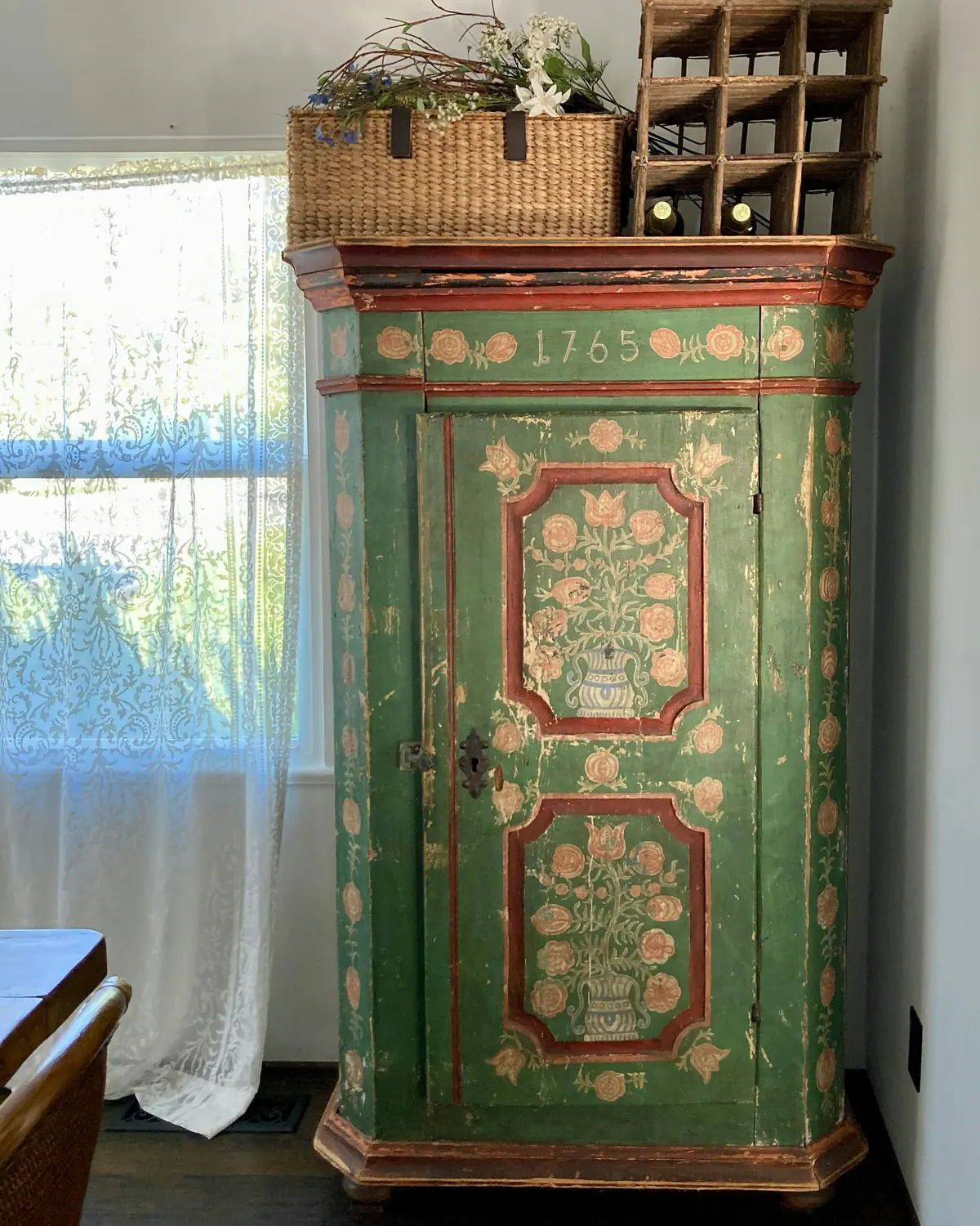
Consider an old green cupboard beside a window. Its painted surface includes floral motifs and a date. The furniture has its own visual identity, quite separate from the wall around it.
It doesn't need the whole room to follow its colors. The cupboard is allowed to be different. A painted piece can be expressive without becoming the beginning of an entirely new decorating scheme.
You can appreciate a colorful cabinet beside a plain wall, familiar curtains and ordinary books. The contrast might be what makes it interesting. And if you already own a piece with character, painting may not be necessary at all. Sometimes the new perspective is simply moving it somewhere it can be seen.
The question before the paintbrush
Painting furniture sounds like a quick project. But not every surface takes the same preparation or finish. Some pieces have coatings that need special care. Others have historical, sentimental or material value that makes a permanent change undesirable. If you're renting, permission may matter too, particularly for built-in furniture.
Before changing anything, look carefully. Is the piece in good condition? Can it be moved or worked on safely? Will the change affect doors, drawers or everyday use? And, most importantly, do you really want to paint it?
A trend should never turn a piece you love into a project you later regret.
If you don't want to paint yet, you can still experiment. Move a colored object onto the shelf. Bring a familiar textile nearby. Rearrange a few books against the existing background. You may discover that the contrast you wanted was already possible.
Color is only half the story
A colorful bookshelf with no books is a very different composition from one filled with objects. That is precisely why the storage trend is worth considering: the furniture and its contents work together.
A painted background gives books, ceramics and photographs another setting. But those objects also interrupt the color. Their shapes, heights and irregular arrangement keep the shelf from becoming one flat painted plane.
You don't need to arrange everything by shade or replace your collection with coordinated accessories. The pieces you already own may be the most interesting part. And if you'd rather take color across a whole room, walls, trim and all, read what color drenching really means.
The best color decision doesn't erase what a room already is. It helps you notice what's been there all along.
A room that still belongs to you
By late afternoon, the cup has moved to the kitchen. The books are still on their shelves, the cabinet remains where it was, and the room looks almost exactly as it did that morning.
Maybe you'll paint the cabinet. Maybe you'll test a color inside the bookshelf. Or perhaps you'll decide the furniture already has enough personality and simply needs a little more attention. All three are valid outcomes.
The 2027 forecast suggests that colorful storage may become a more considered alternative to the familiar accent wall. But a design trend isn't a deadline. It's an invitation to see another possibility, and the most interesting one may be that your room doesn't need a new focal point. It already has one. You just hadn't looked at it that way before.
Sources & notes
- Trend source: Eleanor Richardson, "The 10 Biggest Interior Design Trends of 2027 for a More Considered, Authentic Home", Homes & Gardens (October 2, 2026), section "Colorful Storage as the New Feature Wall".
- Interior designer Rebecca Wakefield is cited there for using an energetic orange, Charlotte's Locks by Farrow & Ball, on shelving in a traditionally detailed home, alongside classic colors including Old White. She explains that books and objects on open shelves soften a strong color and that colored joinery feels more contemporary than a feature wall. This is a documented design example, not a product recommendation.
- The source presents a design forecast and expert observations, not statistics about adoption or sales. No prices are given.
- The quiz, exercises and domestic scenes are original editorial content by ORIGIN. House Studio. The two Unsplash photographs are visual references and do not show Rebecca Wakefield's project.
- Photos (Unsplash License): Tomas Martinez, mohsen ameri.
10:26Una mañana tranquila de sábado
La sala está en silencio. Solo se escucha una cucharita contra una taza de café. Hay libros en la estantería, una planta junto a la ventana y un aparador de madera que lleva años en el mismo lugar.
Hace tiempo que piensas en cambiar algo. Quizá pintar una pared. Tal vez sumar un color más intenso en algún rincón. Pero cada vez que imaginas una superficie grande completamente pintada, aparecen las dudas. ¿Y si te cansas del color? ¿Y si resulta demasiado?
Entonces miras el aparador. Es más pequeño que la pared. Ya forma parte de la habitación. Y quizá sea el lugar perfecto para comenzar.
Tal vez tu próxima idea de decoración no tenga que suceder en una pared.
La pared que ya no necesitas pintar
Una idea conocida del interiorismo se está replanteando para 2027. En su informe de octubre de 2026, Homes & Gardens señala los muebles de guardado pintados de color como una alternativa a la clásica pared de acento.
En lugar de pintar una pared para crear un punto focal, los diseñadores miran las estanterías, los armarios empotrados, los nichos y los muebles independientes. La propuesta consiste en llevar el color a algo que ya tiene una función.
Una biblioteca guarda libros. Un armario contiene objetos cotidianos. Un nicho puede exhibir cerámicas, fotografías o piezas reunidas con el tiempo.
Cuando estas superficies se pintan, el color se integra con el mueble y su contenido, en lugar de aparecer como una declaración aparte detrás de todo lo demás. Es una posibilidad interesante si quieres dar más personalidad a una habitación sin convertir cada pared en un proyecto. Y no exige reemplazar los muebles.
Un poco de color, mucha personalidad
El informe presenta un ejemplo de la diseñadora Rebecca Wakefield. En una casa con colores y detalles tradicionales, usó un naranja enérgico en unas estanterías y lo equilibró con tonos más clásicos.
Su razonamiento es especialmente interesante. Los libros y objetos de los estantes abiertos suavizan la presencia de un color intenso. En lugar de una superficie pintada sin interrupciones, la mirada también encuentra libros, cerámicas y objetos cotidianos.
Para Wakefield, la pared de acento puede ser una manera bastante anticuada de sumar color, y la carpintería pintada resulta más contemporánea.
Eso no significa que pintar una pared sea siempre un error. Significa que existe otro lugar donde considerar el color, y quizá uno más personal. Las estanterías no son superficies vacías. Ya contienen parte de tu vida.
Empieza por lo que ya tienes
Imagina tu propia biblioteca. Quizá es blanca, de madera o está pintada de un color al que apenas prestas atención desde hace años. Hay libros en vertical, otros apilados, una fotografía y un cuenco que antes estaba en otra habitación.
Ahora imagina la estructura en otro color. Los libros permanecen. La fotografía sigue allí. No necesitas reemplazar el cuenco. Sin embargo, el nuevo fondo cambia la manera en que ves esos objetos.
Aquí el color se vuelve interesante: no como excusa para comprar cosas nuevas, sino como una oportunidad para mirar de otra forma las que ya tienes.
Antes de elegir un tono, pregúntate qué quieres cambiar realmente. ¿Quieres que el mueble sea el protagonista? ¿Prefieres destacar los objetos que guarda? ¿O simplemente tienes curiosidad por ver cómo un poco de color podría transformar la habitación? Son intenciones diferentes y merecen soluciones distintas.
Cinco preguntas, tres perfiles posibles. Elige la respuesta que mejor refleje tu manera de vivir; si hay empate, decide tu respuesta a la última pregunta.
Ningún resultado es más sofisticado que otro. La cantidad adecuada de color es la que tiene sentido en tu casa.
Un mueble de color intenso necesita una habitación igual de llamativa.
Una estantería o un armario de color puede convivir con ambientes tranquilos o tradicionales. El ejemplo de Homes & Gardens combina estantes de un color enérgico con tonos y detalles clásicos, y deja que los libros y objetos suavicen el conjunto.
Lo que enseña un armario antiguo
Observa un armario verde junto a una ventana. Su superficie pintada tiene motivos florales y una fecha. El mueble tiene una identidad propia, diferente de la pared que lo rodea.
No necesita que toda la habitación repita sus colores. El armario puede ser distinto. Un mueble pintado puede tener personalidad sin convertirse en el comienzo de una decoración completamente nueva.
Puedes disfrutar de un armario de color junto a una pared lisa, unas cortinas conocidas y los libros de siempre. Quizá el contraste sea justamente lo que lo hace interesante. Y si ya tienes una pieza con carácter, puede que ni siquiera necesites pintarla. A veces basta con colocarla donde se pueda apreciar mejor.
La pregunta antes de tomar la brocha
Pintar un mueble parece un proyecto sencillo. Pero no todas las superficies necesitan la misma preparación ni el mismo acabado. Algunas piezas tienen revestimientos que requieren cuidados especiales. Otras tienen un valor histórico, sentimental o material que hace poco conveniente un cambio permanente. Si alquilas, también puede que necesites permiso, sobre todo con los muebles empotrados.
Antes de cambiar algo, observa con cuidado. ¿El mueble está en buen estado? ¿Puedes moverlo o trabajar sobre él de forma segura? ¿El cambio afectará las puertas, los cajones o su uso diario? Y, sobre todo, ¿de verdad quieres pintarlo?
Una tendencia nunca debería convertir un mueble que aprecias en un proyecto del que después te arrepientas.
Si todavía no quieres pintar, puedes experimentar de otras maneras. Coloca un objeto de color en un estante. Acerca una tela que ya tengas. Reorganiza algunos libros sobre el fondo actual. Quizá descubras que el contraste que buscabas ya era posible.
El color es solo una parte de la historia
Una biblioteca pintada y vacía es una composición muy distinta de otra llena de libros y recuerdos. Justamente por eso esta tendencia merece atención: el mueble y su contenido funcionan juntos.
Un fondo de color les da otro escenario a los libros, las cerámicas y las fotografías. Pero esos mismos objetos también interrumpen el color. Sus formas, alturas y posiciones irregulares evitan que la estantería se vea como una superficie plana pintada.
No necesitas ordenar los libros por tonos ni reemplazar tu colección por accesorios que combinen. Las piezas que ya tienes pueden ser lo más interesante del conjunto. Y si prefieres llevar el color a toda una habitación, con paredes y molduras incluidas, descubre qué es realmente el color drenching.
La mejor decisión de color no borra lo que una habitación ya es. Te ayuda a descubrir lo que siempre estuvo allí.
Una habitación que sigue siendo tuya
Al final de la tarde, la taza ya volvió a la cocina. Los libros siguen en sus estantes, el aparador continúa donde estaba y la habitación se ve casi igual que por la mañana.
Quizá pintes el armario. Tal vez pruebes un color en el interior de la biblioteca. O puede que decidas que el mueble ya tiene suficiente personalidad y solo necesita que le prestes más atención. Las tres decisiones son válidas.
Las previsiones para 2027 sugieren que los muebles de guardado pintados pueden convertirse en una alternativa más pensada a la clásica pared de acento. Pero una tendencia no es una fecha límite. Es una invitación a ver otra posibilidad, y quizá la más interesante sea que tu habitación no necesita un protagonista nuevo. Ya tiene uno. Simplemente no lo habías mirado de esa manera.
Fuentes y notas
- Fuente de la tendencia: Eleanor Richardson, "The 10 Biggest Interior Design Trends of 2027 for a More Considered, Authentic Home", Homes & Gardens (2 de octubre de 2026), sección "Colorful Storage as the New Feature Wall".
- Allí se cita a la diseñadora Rebecca Wakefield, que usó un naranja enérgico, Charlotte's Locks de Farrow & Ball, en unas estanterías de una casa con detalles tradicionales, junto a colores clásicos como Old White. Explica que los libros y objetos en estantes abiertos suavizan un color intenso y que la carpintería de color se ve más actual que una pared de acento. Es un ejemplo documentado, no una recomendación de compra.
- La fuente recoge previsiones y opiniones profesionales, no estadísticas de adopción ni de ventas. No se mencionan precios.
- El quiz, los ejercicios y las escenas domésticas son contenido editorial original de ORIGIN. House Studio. Las dos fotografías de Unsplash son referencias visuales y no muestran el proyecto de Rebecca Wakefield.
- Fotos (licencia de Unsplash): Tomas Martinez, mohsen ameri.